It’s all about asking the right questions
How to improve conversion? How can we make the user experience intuitive and engaging?
What exactly do our customers want?
These are the questions that product designers are asking themselves most of the time and finding the right answers can be a really difficult task. But what about if we narrow the scope and start asking the right questions?
Almost 1 year ago we’ve launched a new version of sportsbet.io which was re-designed and re-branded. Throughout a year we have added many new features and have built a world cup centre for the main event of the year - FIFA World Cup 2018 in Russia which proved to be very successful for us.
But most of the time we were focusing on delivering new features and not on improvements, so after the WC2018 improving the user experience and user journey became our main focus.
Back in December 2017 we’ve decided that our main principle at sportsbet.io would be data-driven decisions, so after almost a year we’ve gathered a lot of data which helped us make the right decisions, but in order to make the right decisions based on data, we can’t rely just on one source. Instead, the more sources of data you can get your hands on the better. Google analytics, Fullstory, Business Intelligence, and surveys became our main data sources for making key decisions.
So coming back to asking the right questions, we’ve asked ourselves: What is our customer’s main struggle and what should be improved first?
Prioritisation
Through the UX analysis, we understood that there would have to be a lot of design changes to be made at the same time we had major performance issues. There is a saying: if you chase two rabbits at the same time both are going to get away. One being the UX/UI improvements and the other would be the Performance. So the correct question you need to ask yourself here would be “which one to prioritise first?” The answer to that one was obvious: no matter how good the UX/UI would be if it's slow — no one will use it.
So our main goal after the World Cup became the performance while in the background the design team concentrated on improving the UX/UI.
While there is a lot of interesting stories and thoughts on how to improve the performance in this article I would concentrate on the design.
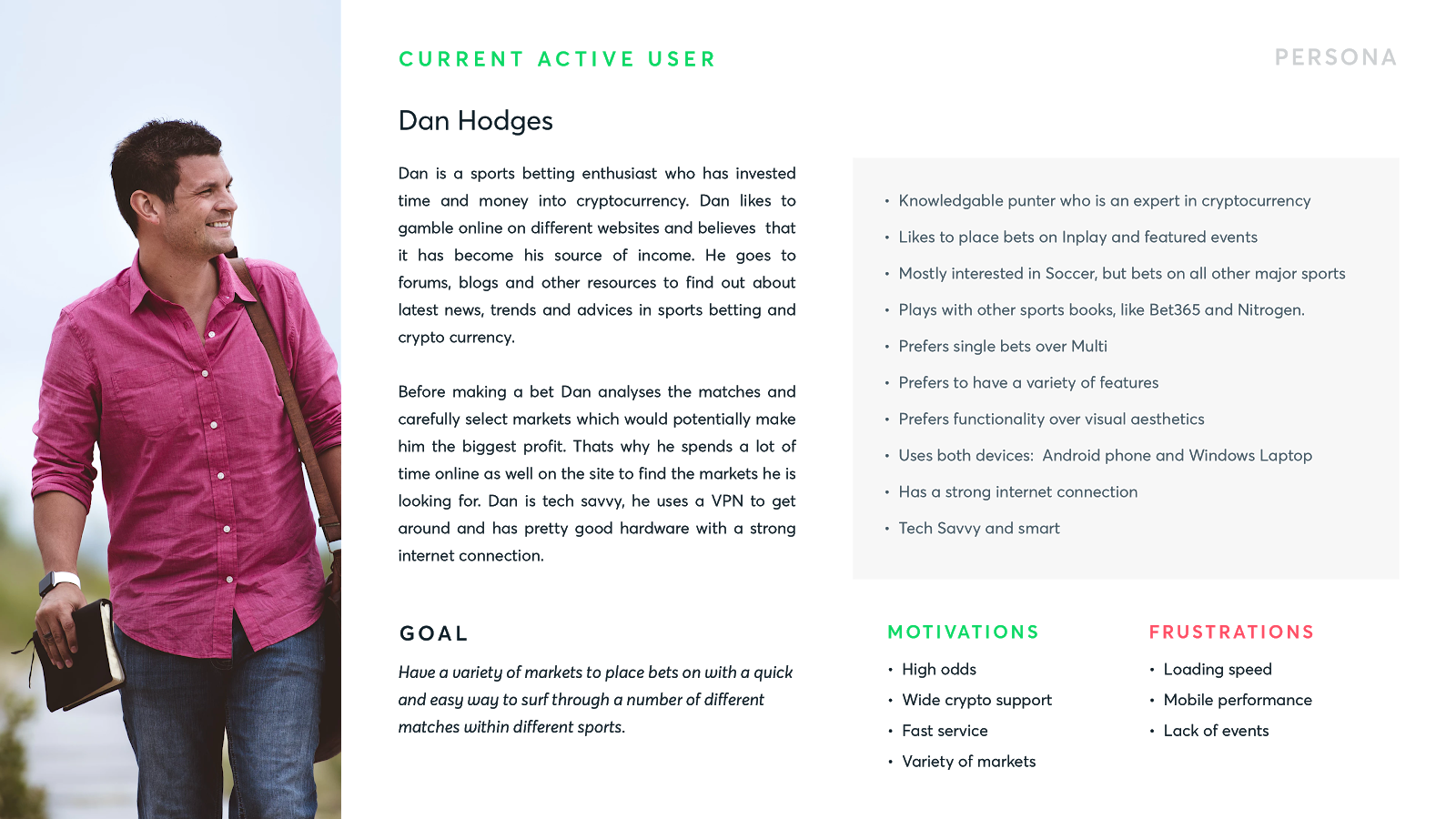
As from the previous article, the description of our customer's persona was quite vague. So after almost a year of gathering data, it became so much clearer.

Our current active customer persona was formed through the analysis of the surveys that we’ve conducted after the WC2018 and of course from main data sources like Google analytics, Fullstory, and Business Intelligence.
This persona would be the key indicator on what kind of improvements we should be focusing on in the first place since I believe the definition of the target audience is one of the most important steps which you have to take first.
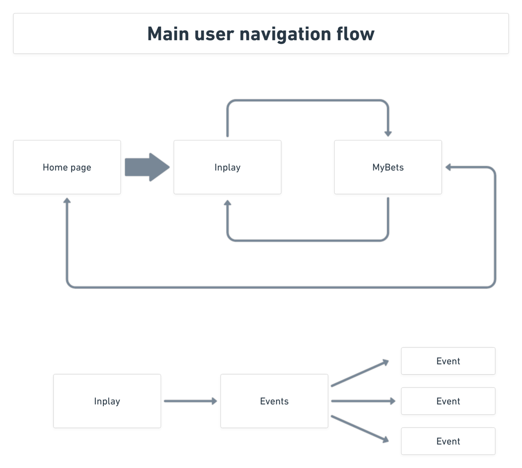
We’ve formed a simplified flow for our main users.
Homepage
Through deep analysis and research we’ve discovered our main problems:
- No proper representation of In-play events on the home page since the majority of bets placed are happening on the In-play page.
- The left navigation is mostly used to go to In-play and popular sports while taking up a lot of valuable real estate. This creates too many UX/UI limitations for other sections of the product.
- Main event carousel is not working as intended — users engage only with the first slide.
- Users do engage with featured events, but since they are not categorised its hard to read through them fast enough.
Possible solution

- 70% of our bets are coming from In-play, therefore live matches should be prioritised first.
- We removed the left side navigation which proved to be unused and moved the most popular sports to top navigation since the average user bets mostly on 3–5 different sports. As well we’ve given an ability for the user to favourite the sports that would be displayed first.
- We’ve replaced the carousel with dynamic components which can be used for promotions or matches. Its also not dependant on the amount promotions, it would adjust and resize itself if there are less or more promotions.
- One of the main problems with old features events was that it was hard to distinguish sports, meaning if a user is only interested in featured soccer events it takes way too much time to recognise the matches in the list. In the improved design, we’ve organised the matches based on a sport.
We haven’t forgotten about mobile improvements as well. It follows the same logic as the desktop version and uses the same components, to see how it functions and looks like check out the link below. https://share.protopie.io/RoGRgMEAb9p
In-play page
The main problem was that users go back and forward from the event page to main category view. Which increases loading times and the number of clicks. Basically makes the user experience unpleasant.

Possible solution
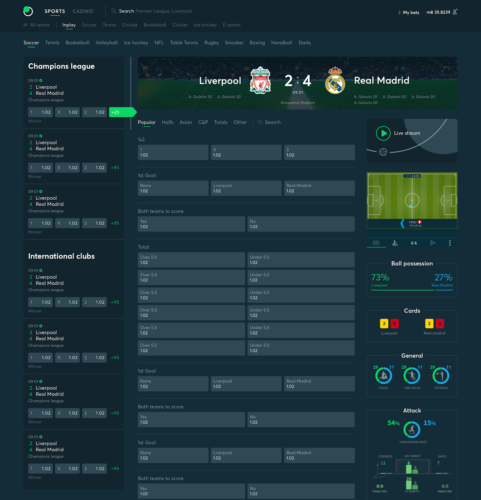
A user would be able to browse through a number of matches without a need to go back and forward to the listing page. To see how it works we’ve used a tool called Protopie and created an interactive prototype: https://share.protopie.io/bKmatp9vkHj
We’ve followed this principle of getting data from every section of the site and through a proper analysis, we were able to ask our selves the right questions and find the right answers.
Usability testing
While analysing the data and creating solutions based on it, it wasn’t still clear if the solutions that we came up with were correct. That's where user testing plays an important role. If done correctly it can save if not weeks but months of development work. We’ve started internal user testing within the company which gave us fast results and led to making changes in design. We then continued to do remote-moderated user testing with our most valuable clients and the feedback we’ve received was incredible. Not only we’ve managed to see whether our design solutions worked or not, but at the same time, our clients felt that they are contributing to the future of sportsbet.io which made them also advocates of the product and the brand.
Atomic design and Design system
By focusing on the performance of the product we wanted to improve the performance of the design process as well. We decided to take the atomic design approach when building the sportsbet.io design system.
Majority of the site is using the same components which are identical not only in mobile but in many other sections of the product as well.
Why is the design system so important?
- Maintaining the Brand. Keeping the same consistency and coherence across all of our digital properties so our entire frontend looks and feels the same across all pages.
- Simplify and prioritise design changes. Currently, they get deprioritised for months. Long run, have a system where UI/UX specialists can change the UI components library and products will be implementing it. It will be updating with minimum attention from developers.
- Documenting and maintaining the entire UI/UX process with actual examples. Reducing the dependencies on individuals. Educating the entire development team on how UI/UX should be done.
- Other teams can use this and build portions of our brand separately while maintaining the high standards of Sportsbet.io (e.g. having a 3rd party build a mobile application)
Takeaways
We can’t just simply trust our assumptions when making key business decisions. In design, development and other areas - data-driven decisions and proper design processes play an essential role in the companies success. That's why our main goal for 2019 is to expand our data analytics team and continue to improve and iterate in a Fast, Fun and Fair way.